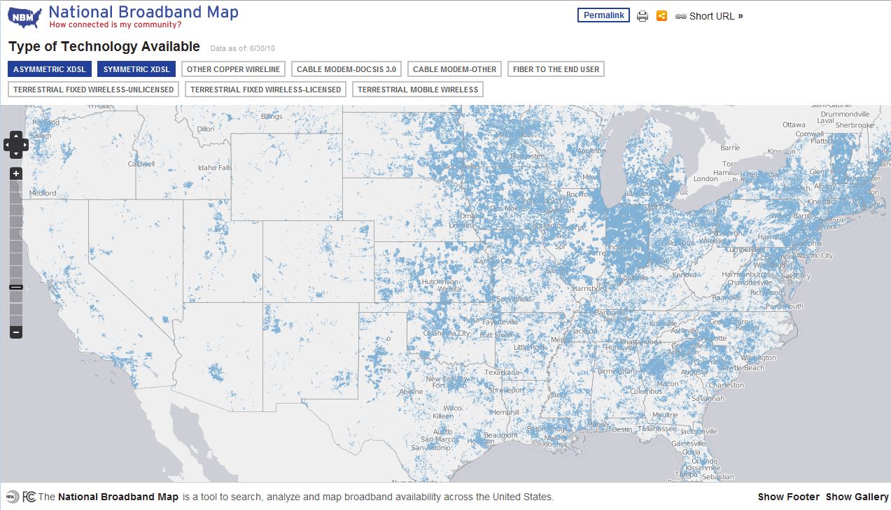
The National Telecommunications and Information Administration (NTIA) in collaboration with the FCC has published a series of broadband maps on a new site called National Broadband Map (NBM). These maps show what broadband services are available throughout the United States as well as other interesting broadband data.
Hit this link and click the “Explorer the Map” option on their main page to see a map of the US with shaded areas where selected broadband services are available. You can click different selections above the map to toggle the various broadband technologies. To see other maps such as advertised versus actual broadband speeds click on the “Show Gallery” option in the lower right hand corner.
Rochester, NY does pretty well on advertised versus actual although there a few slower than advertised points here and there. Upload performance data is also available. Usually the cable and DSL providers don’t brag much about upload performance likely because in most cases it is lousy compared to download performance. I think upload performance will become more important to the typical internet user than it as in the past now that people are sharing their pictures and video online.
The NBM site use a variety of open source technologies including:
- JQuery – My favorite JavaScript library.
- Modernizr – A JavaScript library to detect browser capabilities.
- OpenLayers – Provides a JavaScript API to display WFS and WMS GIS layers.
- GeoServer – A Java based server software that provides WFS and WMS services.
What is particularly interesting about the site is the developer resources. They provide a series of API’s you can call from your own web applications to use their data. Output formats include XML, JSON, and JSONP implementations. If you want to use the data locally without the APIs you can download it.
I do have a couple criticisms regarding the maps and ironically, they are bandwidth related. The first is that there are too many tiles returned when viewing the default map of the US. I noticed the map was a little slow to fill in. When I enabled Firebug and clicked on the “Explore the Map” option off the main page, over 500 tiles were pulled down. In fact, Firefox/Firebug became unresponsive. I would expect less than 30 256×256 tiles need to be pulled down for a reasonably sized browser window. I wager there is something goofy going on like a bounding box not set for the area displayed.
My second criticism is that the site is not using gzip to compress JavaScript files. Modern web applications tend to lay on the JavaScript pretty heavy and this one is no exception. OpenLayers.js is nearly 1MB all by itself. By enabling gzip on sites with large JavaScript files you can significantly improve site performance. This is a good topic for a future post.
Overall I think the National Broadband Map Site is an excellent resource. It provides very useful data on broadband technologies/speeds, makes this data available via APIs or download, and also demonstrates a variety of open source web application technologies.
Is it worth the $20 million that contractors were paid to build the map? I would say certainly not at first glance but I would want to hear the whole story before I jump to conclusions. I.e. how much of that $20 million was spent on actual development? I am much more skeptical of the alleged $293 million required to collect the data.


